5 Tips to Help Choose the Best Font for Your Website

In This Article
Think of choosing a font like choosing an outfit. You wouldn’t wear a bathing suit to a corporate job interview or your interview outfit to a casual brunch with friends.
The outfits we wear are essentially a presentation of who we are, an entryway of the impression you have on others. People make assumptions about our personality, socioeconomic status, age, and so on based on what we wear—whether we like it or not.
Just like our outfits set an external tone of who we are, fonts do the same for design. Choosing a font should be a very careful process. Don’t breeze through the details. Consider these tips when you start looking around for your ideal font.
1. Start with the basics.
As a foundation, you should be familiar with sans serif and serif fonts, as they govern most online/web designs.
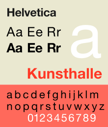
Serif fonts have “feet” attached at the end or bottom of the characters (think Times New Roman). Sans serif fonts do not have feet (see Helvetica). If you ever need help remembering the difference, just know that sans serif literally means “without serif.”
Serif fonts are easier to read on print materials.
Those little feet were originally designed to accommodate print materials created on a typewriter. Even though we don’t use typewriters very often anymore, serifs still come out on top when it comes to creating your own printed works.
Before the 1970s, typewriters were monospaced (letters and characters were the same width and height). Things like double spacing after every sentence (an outdated practice you should avoid), and—you guessed it—serifs created necessary distinction between each letter. This distinction made it easier for our brains to recognize characters quickly, as they guide the horizontal “flow” of our eyes.
Sans serif fonts are better on the web.
Serifs are typically thinner and more narrow than sans serifs. As you could imagine, this makes them much harder to read on a screen. Lower resolutions make serif fonts less legible, as they lose their crisp detail, and thus make the text harder on the eyes.
Print documents actually have a higher resolution than most computer screens—even the super-powerful Apple retina displays—yet another reason they work so well on paper and not-so-well online. But sans serifs? Regardless of resolution or size, they don’t lose their shape. What you see is what you get, no matter what.
Pay attention to contrast.
Contrast is especially important when you’re deciding what fonts to use for your headings. There has to be a clear difference between your heading font and your body font. If you don’t have enough contrast between the two, they wind up blending together, therefore losing organization, structure, and much-needed hierarchy.
While sans serif fonts are more equipped for web, it’s acceptable to use a serif font for headings. Since heading fonts are larger than body fonts, the size difference should help with readability. Just don’t swap the two; never use a serif font for your digital body copy.
Limit the number of fonts you use.
There are thousands of fonts—both free and for purchase—but don’t get font-happy. In fact, don’t use more than three. Your site will start to look mismatched and messy beyond two.
2. Consider browser & screen compatibility.
86% of internet users have cell phones, which means the majority of your users will likely view your website on a mobile device. Whatever font you choose for your website needs to be compatible across multiple devices. Does it look smooth and clean on a desktop? How does it look in Chrome and on Chrome mobile? Do a ton of testing across various tablets, phones, laptops, and desktops.
3. Take note of your brand’s identity, messaging, & purpose of the design.
Yes, this article is catered toward choosing a font for your website, but this is just vital information across the board: Fonts should match the tone, messaging, and purpose of whatever project you’re working on.
Ask these questions:
- How will it look next to other branding materials, like logos and colors?
- Is our tone formal or casual?
- Is the design going to be viewed on print and digital formats, or just one?
4. Explore your options & have fun.
Google Fonts are designed to work well (faster load time, reliable digital readability), but don’t be afraid to explore other web font services. These are some of our favorites:
5. Consider custom fonts.
If you want to take an even more creative outlet with your font choice, consult a graphic designer. Keep an eye out for a designer who doubles as an illustrator and has experience with typography. These design wizards can create fonts completely customized to your liking. You’ll end up with a wholly unique asset to your visual identity, and that’s just plain awesome.
Must-read articles


Looking for something else?
There's so much more
Ready to Inquire?
Contact Us!