Social Media and Web Image Sizes 101: Your Guide to Choosing the Best Photo Size for Your Digital Presence

Images are an essential part of any website. They help to break up the text, add visual interest, and give visitors a sense of your brand. Images matter not just because they look nice or convey information but because they also play a crucial role in page speed, user experience, and search engine rankings. Choosing the right image size will help improve your website on all three fronts.
But first, a quick note on pixels (it’s how we measure image size).
The term pixel (px) usually refers to a single point in a grid of many points that make up an image. The number of pixels in an image determines the image resolution or how clear and sharp the image appears. A higher-resolution image has more pixels and appears sharper than a low-resolution image with fewer pixels.
But we don’t want to use as many pixels as possible because it’ll slow down the site speed. The more pixels in an image, the longer it will take to load.
However, we don’t want to make our image resolution too small even if it makes our website load fast because it will cause the image to be blurry or pixelated, interfering with the user experience.
Finally, we can’t just forgo images altogether because they play a key role in how you get ranked on search engines. Not only do images make content more interesting and increase time on the page—a search engine optimization, or SEO, ranking factor—but you can also add file names and alt text to help you rank on Google image searches.
Clearly, we have to strike a balance, which is why we’ll provide you with some recommendations on the best sizes for each visual element on your website.
JPG vs. PNG
A few image formats are commonly used for web graphics, but the two most popular are JPG and PNG. So, which one should you use for your website?
JPG is an excellent choice for images with lots of detail, like photos. It uses “lossy compression” to reduce the file size. This means that some image data is lost when the file is compressed, but it’s usually not noticeable to the naked eye. The tradeoff is that JPG files are typically smaller than PNG files, which can be important when trying to keep your website’s page load times down.
PNG is a good choice for images with less detail, like logos or icons. That’s because it uses “lossless compression,” which means no image data is lost during compression. The tradeoff is that PNG files are usually larger than JPG files. But since they don’t lose any quality when compressed, they can be a better choice for those types of images.
So, which format should you use for your website? If you’re not sure, go with JPG. It will probably give you the best results in terms of image quality and file size.
What Is the Aspect Ratio?
The aspect ratio of an image is the width of the image divided by the height of the image. It is typically expressed as two numbers separated by a colon. The first number represents the image’s width, while the second represents its height. So an image that is 1080 x 1080 px and an image with 1000 x 1000 px is a 1:1 aspect ratio, which means you can size up and size down an image while maintaining the aspect ratio.
The most common aspect ratios for images used on websites and social media platforms are:
- 16:9
- 9:16
- 1:1
- 3:2
- 4:5
Recommended Website Image Sizes
Background Image | 1920 x 1080 px
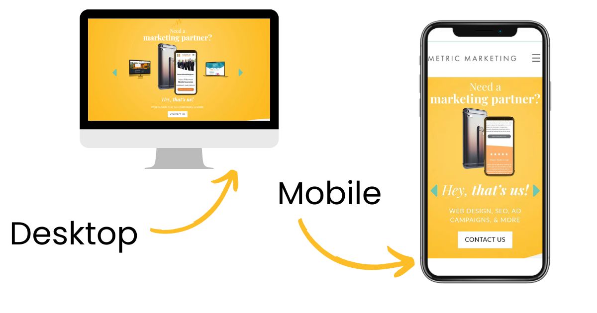
On your website, you might have sections where you plan to use an image that covers the entire screen from left to right. However, background images are more common on the homepage. Ideally, this image will look sharp on desktops, mobile, and tablets. These images might be cropped when scaled down to a mobile device. Utilizing wider shots will ensure the image is effective regardless of which device a visitor is using.
The recommended size to ensure the image isn’t pixelated but doesn’t slow down your load speed is 1920 x 1080 px. The aspect ratio is 16:9. You can technically increase and decrease the image size if you maintain the same aspect ratio; however, you’ll either be sacrificing speed or quality to do so.
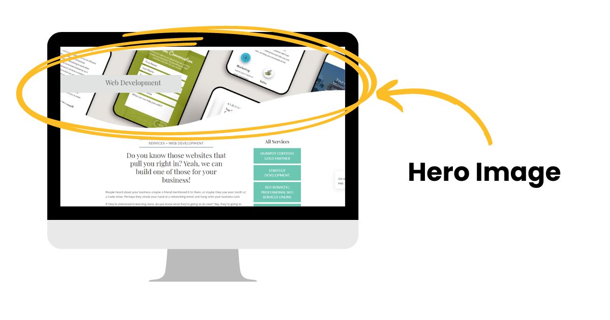
Hero Image | 1280 x 720 px
A hero image is a large image prominently displayed on a website, often in the header or above the fold. Sometimes this is also called a banner image. Hero images are usually high quality and visually striking, and they can be used to convey a message or evoke an emotion.
When choosing a hero image, you must consider both the visual impact and the message you want to convey.
There are a few size options:
- 1920 x 1080 px
- 1366 x 768 px
- 1440 x 900 px
- 1536 x 864 px
- 1280 x 720 px
Depending on your website, you could use 1280 x 720 px, the minimum resolution for a hero image. If you choose to increase the resolution, you’ll slow down your page load speed.
Blog Feature Image | 1200 x 630 px
The image at the top of your blog post is important because it will often show up when you share the link externally, like on social media. It’s best to keep social sharing in mind when you choose your image size.
Additionally, blog images shouldn’t be as large as background images or hero images. Typically, blog images are 1200 x 630 px, which is a 3:2 aspect ratio. However, you can increase the size if your images are pixelated.
Slideshow Galleries | 1280 x 720 px
Slideshows are a great way to add more images to your website without taking up too much space. Your slideshow images should be large enough to look good but small enough not to slow down the page load time.
The recommended size for slideshows is 1280 x 720 px—the same size as a hero image. This size also allows for a lot of detail and works well with most themes.
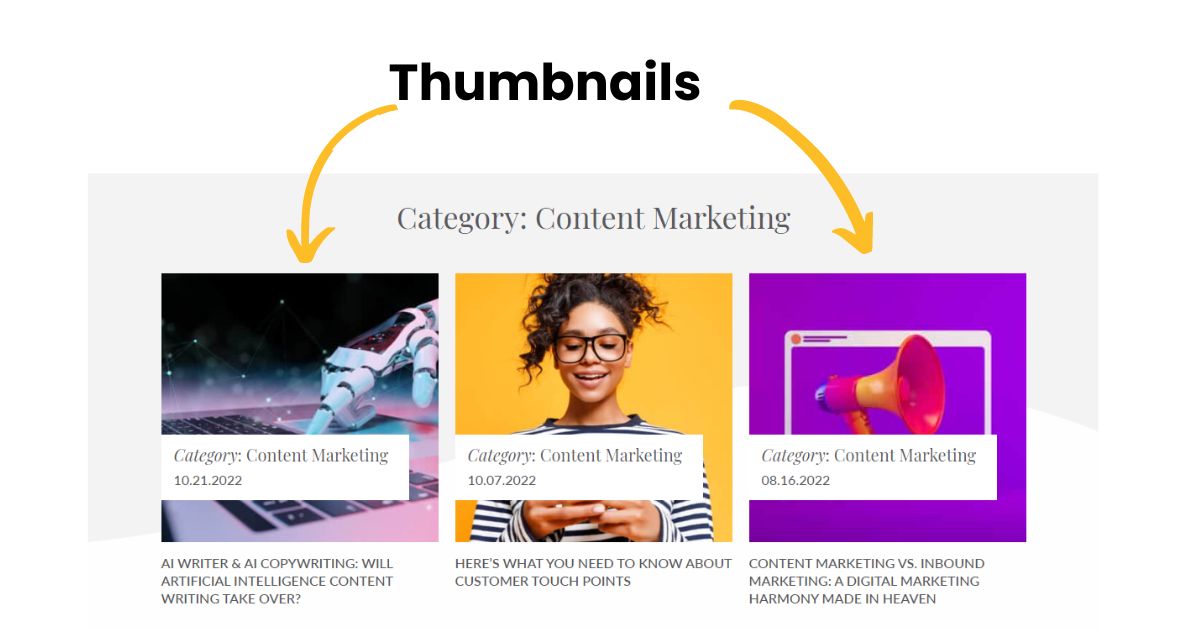
Thumbnails | 150 x 150px
Thumbnails are small images typically used to represent a larger image or video. Thumbnails generally link to a larger version, so they should be attractive enough to draw the user’s attention but not too large to slow down the page load time.
The recommended size for thumbnails is 150 x 150 px. Sometimes, thumbnails are generated automatically depending on your website template. In this case, you’ll want to ensure your feature image looks sharp and makes sense in a smaller version or different aspect ratio. At times, you might also want larger thumbnails. It depends on your website template.
Logo Image | 250 x 150 px
Your website’s logo image is very important. It’s the symbol that will be used to represent your brand and should be recognizable at any size. Your logo must be versatile and scalable to be legible on various devices. There is no perfect size for a logo, but rather a series of decisions you’ll have to make based on your specific situation.
For example, you should have variations of your logo dimensions, including horizontal, vertical, and square. You’ll also want black, white, and full-color versions.
Ideally, you’ll opt for a PNG format, as that won’t slow down your website because a logo is smaller and less detailed than other website images. It’ll range from 250 x 150 px to 400 x 100 px for horizontal versions. Vertical versions are typically 160 x 160 px.
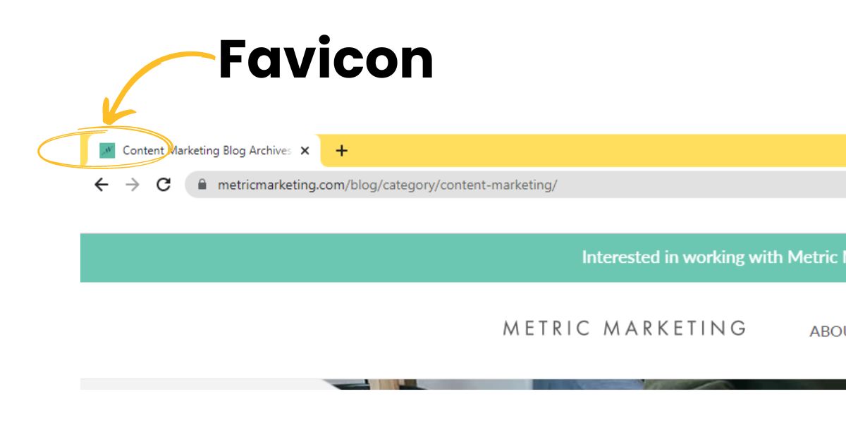
Favicon | 32 x 32 px or 16 x 16 px
A favicon is a small image that appears in the tab of your web browser and functions as an identifier for your website. Most importantly, this image should be recognizable, so it’s essential to get the size right. The recommended size is 32 x 32 px, usually a PNG. Most companies will opt to use a version of their logo. However, it can be as small as 16 x 16 px. Most designers will start with the larger version and scale it down when necessary.
Social Icons | Size Varies
Social media icons make it easier for visitors to follow you on various platforms where you might post timely, relevant information. Several website hosting platforms will have the ability to activate social icons without having to upload any images, including Squarespace, Wix, and HubSpot. In this case, the sizes are already created.
However, if you add these icons manually, you’ll have to follow brand guidelines for each platform:
- Facebook Brand Guidelines
- Instagram Brand Guidelines
- Twitter Brand Guidelines
- LinkedIn Brand Guidelines
- YouTube Brand Guidelines
- Pinterest Brand Guidelines
The recommended size for social icons depends on the platform, but they usually range from 40 to 60 px.
These are just a few common types of images used on websites, and some recommended sizes for each. Before adding images to your website, be sure to consider the impact they have on page speed. Some larger images may slow down your website significantly if not appropriately compressed. As with all design decisions, it’s crucial to balance visuals with functionality.
Social Media Image Sizes
One of the most important aspects of using images and videos on social media is making sure you select the right size. If you don’t, your post may not look as good as it could, or it may not be visible at all. Social media platforms have different image and video size requirements.
Remember to consider mobile users when you stage your photo for certain elements, like your page’s cover photo. You might need to restructure the image so words or features are not cut off when it’s sized for different devices.
Below is a comprehensive list of image and video sizes for each social media platform.
- Profile picture: 400 x 400 px
- Profile background cover photo: 1584 x 396 px
- Company logo on pages: 300 x 300 px
- Company banner page cover: 1128 x 191 px
- Image or multi-image post: 1080 x 1080 px or 1920 x 1080 px
- Shared link image: 1200 x 627 px
- LinkedIn article feature image: 1200 x 644 px
- Company logo for ads: 100 x 100 px
- LinkedIn Stories:- 1080 x 1920 px
- LinkedIn video file size: 720KB to 200MB
- LinkedIn maximum video size: 4096 x 2304 px
- Profile photo: 320 x 320 px
- Photo posts: 1080 x 1080 px or 1080 x 1350 px
- Thumbnails: 161 x 161 px (display), 1080 px wide upload size
- Stories: 1080 x 1920 px
- Reels: 1080 x 1920
- Videos: 1080p (minimum) to 4K (maximum); resolution ratio is 9:16
- Video file size: 650MB (maximum for videos 10 minutes or less), 3.6GB (maximum for videos up to 60 minutes)
- Newsfeed image: 1200 x 630 px or 1080 x 1080 px
- Link thumbnail: 1200 x 630 px
- Carousel display: 1200 x 1200 px
- Facebook Stories: 1080 x 1920 px
- Cover photo: 820 x 360 px
- Profile photo: 176 x 176 px
- Event cover photo: 1200 x 628 px
- Video uploads: 1920 x 1080 px
- Feed ads: 1080 x 1080
- Marketplace ads: 1080 x 1080
- Profile photos: 400 x 400 px
- Header photo: 1500 x 500 px
- In-stream photo: 1200 x 675 px
- Carousels: 800 x 800 px
- Video uploads: 1280 x 720 px or 720 x 720 px
YouTube
- Profile photo: 800 x 800px
- Banners: 2048 x 1152 px
- Custom thumbnail: 1280 x 720 px (minimum)
- Video resolutions:
- (8K): 7680 x 4320 px
- (4K): 3840 x 2160 px
- 2560 x 1440 px
- 1920 x 1080 px
- 1280 x 720 px
- 854 x 480 px
- 640 x 360 px
- 426 x 240 px
- YouTube Shorts: 1080 x 1920 px (60-second maximum)
TikTok
- Profile picture: 200 x 200 px
- Video uploads: 1080 x 1920 px (3 seconds – 10 minutes)
- Video file size: 287.76 MB (Apple) or 72 MB (Android)
- Profile photo: 165 x 165 px
- Profile cover photo: 800 x 450 px
- Pins: 1000 x 1500 px (or 600 x 900 px, 1200 x 1800 px, or 2000 x 3000)
- Story pins: 1080 x 1920 px
- Board cover photos: 600 x 600 px
- Video size: 1000 x 1500 px or 1000 x 1000 px
- Video length: 4 seconds to 15 minutes
Snapchat:
- Snapchat ads image: 1080 x 1920 px
- Geofilter designs: 1080 x 2340 px or 1080 x 1920 px (9:16 aspect ratio)
These are just some of the most popular social media platforms and their recommended image sizes. Check each platform’s guidelines before posting any images or videos. It’s also important to note that these sizes may change, so stay up-to-date on the latest requirements.
By following these size guidelines, you can ensure that your images and videos are optimized for the best viewing experience on each platform. This will help you make the most of your online presence and maximize engagement with your content.
Bonus tip: It’s also a good idea to create a brand style guide to keep all these sizes in one place. This is especially helpful if you create images and videos for multiple social media platforms. You’ll save time, keep everything consistent, and ensure that your visuals look great on any device or platform! Or save yourself some time by bookmarking our handy list.
Metric Marketing Can Help You Build a Digital Marketing Strategy
Building an effective website and a comprehensive social media marketing strategy involves lots of moving parts. The best part of hiring Metric Marketing is that our team of experts can bring your marketing dreams to life while saving time that you can invest in other important aspects of your business.
We specialize in comprehensive marketing strategies and would love to chat with you today about how we can help you take your marketing efforts to the next level.
Contact us at (734) 404-8714 or fill out our online contact form today. We look forward to hearing from you!
So, you have a question?
We have an answer!
Ready to Inquire?
Contact Us!
